Right now, millions of consumers are facing a simple problem. Or rather, they’re facing a problem with simplicity, as both the number of smart products and the functions of those products multiply.
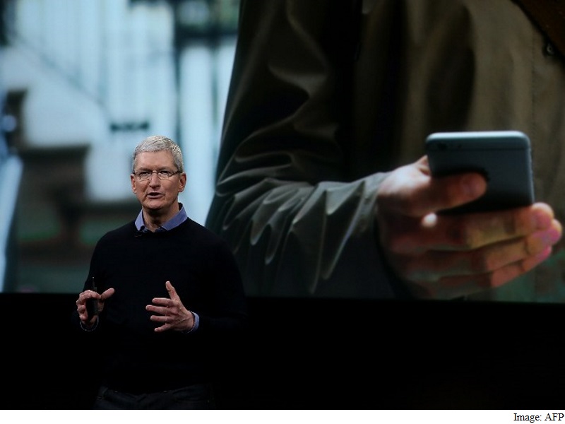
I was recently reminded of this when I tried to quickly snap a picture at Apple’s launch event. I tried to double-click the home button on my locked Galaxy S6 to call up the camera quickly. I took just a moment too long, triggered the fingerprint reader and unlocked my phone instead, and completely missed the shot.
It was a momentary irritation. But it did make me -at the ripe, old age of 30 – a little wistful for the days when buttons on devices had one function. And it also made me sympathize with the many readers I hear from who say that managing their devices, or even just using basic software, is just getting too complicated.
They’re not alone. Take, for example, a 2016 Accenture study, which found that 16 percent of consumers who’ve tried to buy an Internet of Things device found it too complicated to use. Even worse, 18 percent of consumers couldn’t even get those devices to connect to the Internet. Or a 2015 study from J.D. Power’s interactive vehicle report found that one-fifth of drivers using cars with smart dashboards were never even tried to use 16 of 33 common vehicle software features such as automatic parking.
That’s not a function of slowing innovation or technological progress these features have been developed and shipped in finished products. If most people still don’t understand how to use them? That’s a design problem.
“We’ve moved into an age where the ubiquity and complexity of toolsets outpace the ability to leverage them tastefully,” said Jason Mayden, a Stanford design fellow who once led design for Nike’s Jordan Group and worked on the company’s wearable fitness tracker, the Fuel Band. “It can’t look like a science project. People don’t want ‘Star Trek.’ They want ‘Minority Report.'”
But software isn’t getting easier to use. In fact, it’s quite the opposite.
For years, the simplicity crown has gone to Apple, which has been a ferocious champion for clean design that doesn’t give you more information than you strictly need. “We’re rolling off of five to eight years with a set of thoughts, promulgated initially by Apple, that is almost cultish that simplicity must come first,” said designer John Underkoffler of Oblong Industries – who, by the way, actually did design those futuristic menus in “Minority Report.”
But now, even at Apple, the crown is showing signs of slipping. For example: Have you looked at iTuneslately?
What started as a simple program for buying, storing and downloading music has morphed into a much larger program for TV shows, movies, podcasts, apps, streaming music and device management. At times, it can feel like a building that’s being repeatedly expanded and renovated in a new architectural style every time.
Or, as Underkoffler puts it, “It started out as a charming bungalow. Now it’s got turrets, a garage for a zamboni, and a helipad on the top.”
There’s been a recent wave of Apple criticism from long-time supporters, including the very-respected Walt Mossberg, who worry the company’s lost its way when it comes making to simple programs that just work. And that may be true. But it would be impossible to expect Apple to keep iTunes as simple as it was when it was first introduced. That’s just not the world we live in anymore.
Companies like Apple and Google are expanding the scope of what they offer – they aren’t hawking one kind of hardware or one type of software, but rather a combination of both, often with several cloud services thrown in for good measure. Apple is no longer a focused iPod-and-Mac company. So the current version of iTunes has to offer so much more than just a way to get digital music.
Google (or Alphabet) is no longer just a search bar on a Web page, it’s a whole ecosystem of information, software programs and an expanding universe of devices. The simple designs of the past products from these companies were never meant to accommodate the range of offerings that are now demanded by consumers.
Yet while companies are offering more functionality to their customers, it is true that they’re not presented in a way most of us can use. Even when things are designed to be clean, its often not done clearly enough. Removing unnecessary text, for example, is one way to easily clean up a design. But I often get emails from readers asking me about symbols they don’t understand on their phones. (Biggest offenders, per my inbox: Android’s copy and paste icons, and iOS’ share icon.)
Which gets us to the next problem: Simple design is far from simple. Underkoffler believes another part of the current problem is also that we’re asking our devices — particularly our smartphones to handle way more work than they were ever designed to take.
“The suggestion from Apple and others is that you can forget your laptop and your desktop, forget about adult computing all you need is this little thing,” he said. Steve Jobs, Underkoffler said, famously compared PCs and tablets to cars and trucks and pointed out that not everyone needs a heavy-duty truck to do everything. But now we’re doing more work on phones, he said, which is frankly a ridiculous thing to do.
“You’ve given people more of a skateboard or a unicycle. You can’t bring the groceries home on that,” he said.
In other words, simplicity itself can’t be the aim all of the time, he said.
“There’s danger of making things so simple that everyone can use them, because then there’s not that much to do and not that much to learn on a device,” he said. “And once you’ve made that assertion, you’ve painted yourself into a corner. And we end up kind of where we are now.”
Meanwhile, these challenges are only going to get tougher as digital interfaces show up in more unexpected places – and sometimes with even less real estate than your standard smartphone screen. Communicating effectively is going to be even more key as companies have to convey information on watchfaces, the domes of thermostats or – very crucially, when it comes to clarity – on the dashboard of your car.
The hope is that companies may take this opportunity for a design reset. Underkoffler pointed to the recent introduction of products like the iPad Pro as an example of a reaction to simplicity that went too far, with tablets that have sort of morphed back into an earlier form with support for keyboard, trackpads and styluses to actually support the behaviors of users, rather than trying to create new ones.
That seems about right to him, he said. “The way we think about it at Oblong is that things should be as simple as possible, but no simpler,” he said.
So, with all of these factors at play and more changes to come, is there anyone out there who’s doing clear and simple design well?
Mayden had an answer pretty quickly: Tesla.
The car company, Mayden said, is answering the right kinds of questions from a design standpoint, looking not only at the new technology but also thinking about how their product fits into consumers’ lives. That combines the skills of designers and technologists, he said, and earns them his pick for the current design champions of the world.
“I think Tesla’s the closest, because they started out by saying we want to make a better vehicle and it happens to be electric. They took the approach of better problems to solve,” Mayden said. “And I think Elon (Musk, Tesla’s chief executive) as a person is the craftsman — more Charles Eames than Tony Stark.”
© 2016 The Washington Post
Download the Gadgets 360 app for Android and iOS to stay up to date with the latest tech news, product reviews, and exclusive deals on the popular mobiles.
[“source-Gadgets”]
| M | T | W | T | F | S | S |
|---|---|---|---|---|---|---|
| 1 | 2 | 3 | 4 | 5 | 6 | 7 |
| 8 | 9 | 10 | 11 | 12 | 13 | 14 |
| 15 | 16 | 17 | 18 | 19 | 20 | 21 |
| 22 | 23 | 24 | 25 | 26 | 27 | 28 |
| 29 | 30 | |||||


